

Unite
Brand Identity // Web Design
I was really pleased that Unite approached me with a chance to be part of this bold ambition—to redefine itself as Unite | The Agency Alternative. Having already built a strong reputation for cutting through the noise, the goal was to push things further: to craft a refreshed identity that felt edgier, faster, and unmistakably non-corporate. The new direction needed to channel the energy of a creative disruptor—one that stands apart from the polished predictability of traditional agencies.
Visit: uniteandcreate.com
Drawing inspiration from sports and fashion culture, the new logo embodies movement, speed, and attitude. Its design rejects unnecessary ornamentation, instead opting for simplicity and strength—a mark that feels confident in its difference. The refreshed colour palette continues to champion Unite’s signature orange and black but introduces more mature, balanced tones to support flexibility across digital and print applications.


Typography became a key storytelling device, blending serif and sans-serif typefaces to symbolise the meeting point of heritage and modernity—experience with a forward-thinking edge. This duality captures Unite’s ethos: rooted in craft, but driven by rebellion.
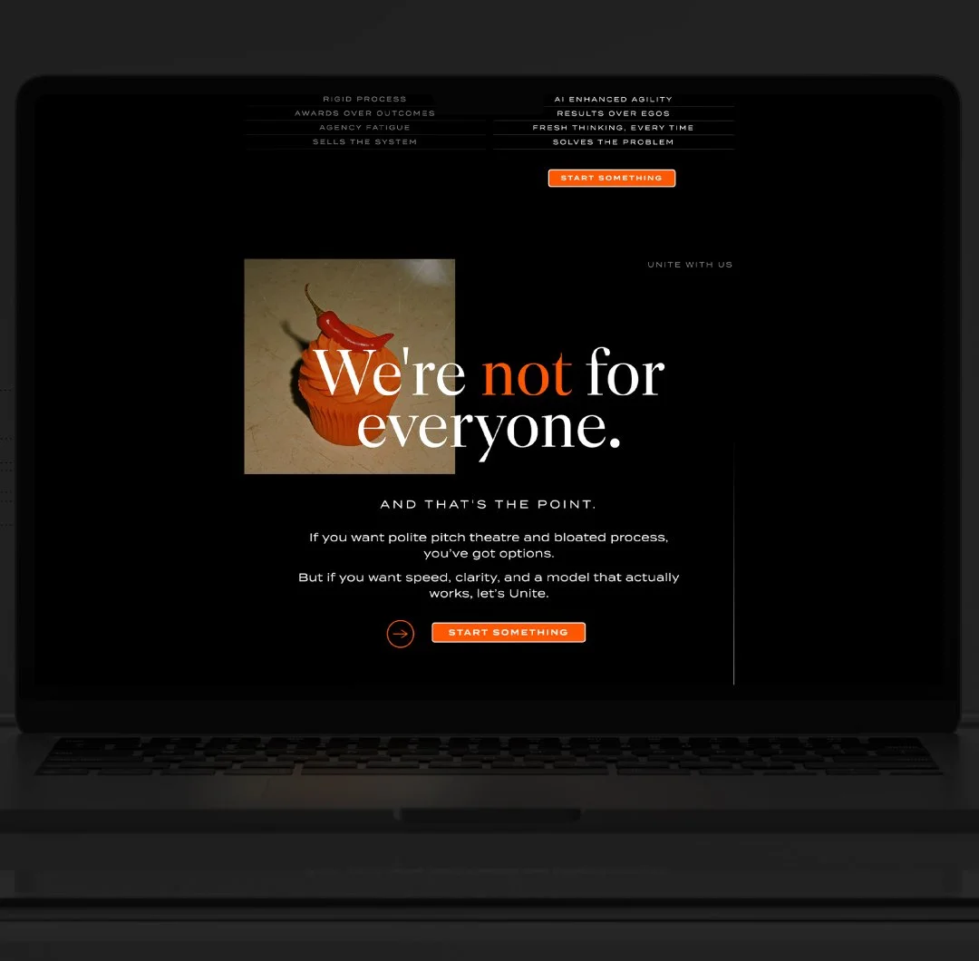
The creative direction for imagery brought the concept of “The Agency Alternative” vividly to life. Campaign visuals played with unexpected contrasts and tongue-in-cheek ideas—a chilli on a cupcake with the line “Not for everyone”, a freshly shaven sheep under the words “No fluff.” These playful yet purposeful statements embody Unite’s straight-talking, results-focused personality.

Through this refresh, Unite has evolved into a brand that proudly challenges industry norms—an agency unafraid to do things differently, grounded in authenticity and creative conviction.
