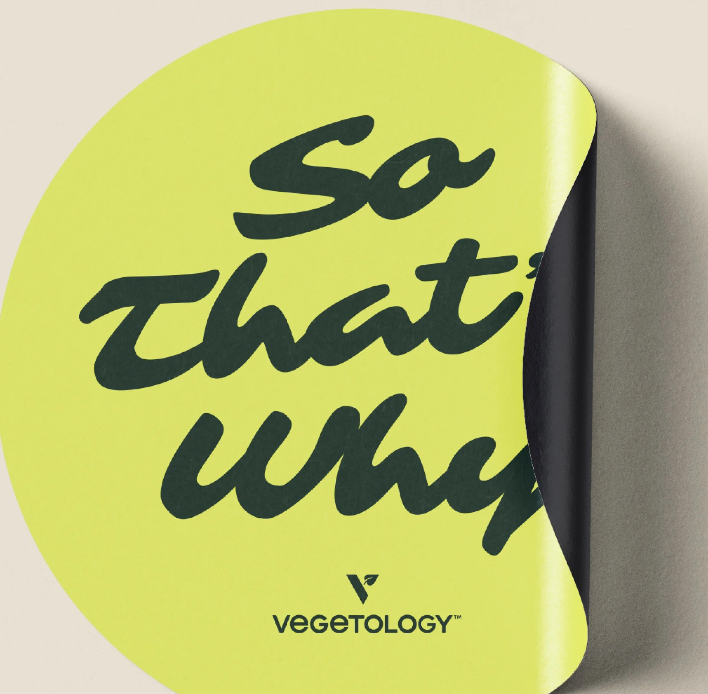
So That’s Why
Brand Identity
Working with Vegetology, we helped bring So That’s Why to life. A new podcast built around unpacking common questions and myths in health, in a way that feels relaxed, clear, and easy to follow. It’s aimed at a young to middle-aged audience, so the balance was making it informative without ever feeling heavy, while naturally introducing Vegetology’s supplement range along the way. We worked across the full brand, from identity through to social, web and motion, setting things up so it can grow as the podcast does.
Working with Vegetology, we helped bring So That’s Why to life. A new podcast built around unpacking common questions and myths in health, in a way that feels relaxed, clear, and easy to follow. It’s aimed at a young to middle-aged audience, so the balance was making it informative without ever feeling heavy, while naturally introducing Vegetology’s supplement range along the way. We worked across the full brand, from identity through to social, web and motion, setting things up so it can grow as the podcast does.
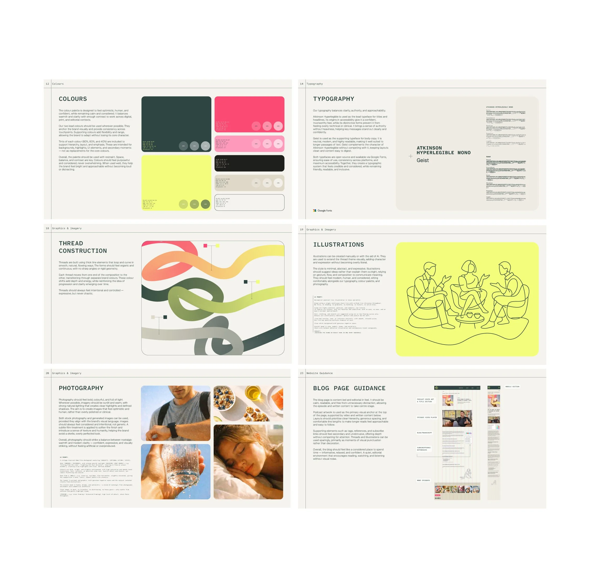
Our key theme was curiosity. That feeling of following a thought, pulling at it a bit, and seeing where it leads. We brought that to life through these ‘threads’ running through the identity, representing ideas being explored and gradually untangled. It gave us something simple but meaningful to build from.
The tone stays conversational and open, but still feels grounded and trustworthy. Typography does a lot of the heavy lifting here, keeping things clear and structured, with just enough character to keep it engaging. The colour palette comes from Vegetology’s range, so it feels bright, optimistic, and naturally connected back to the brand.
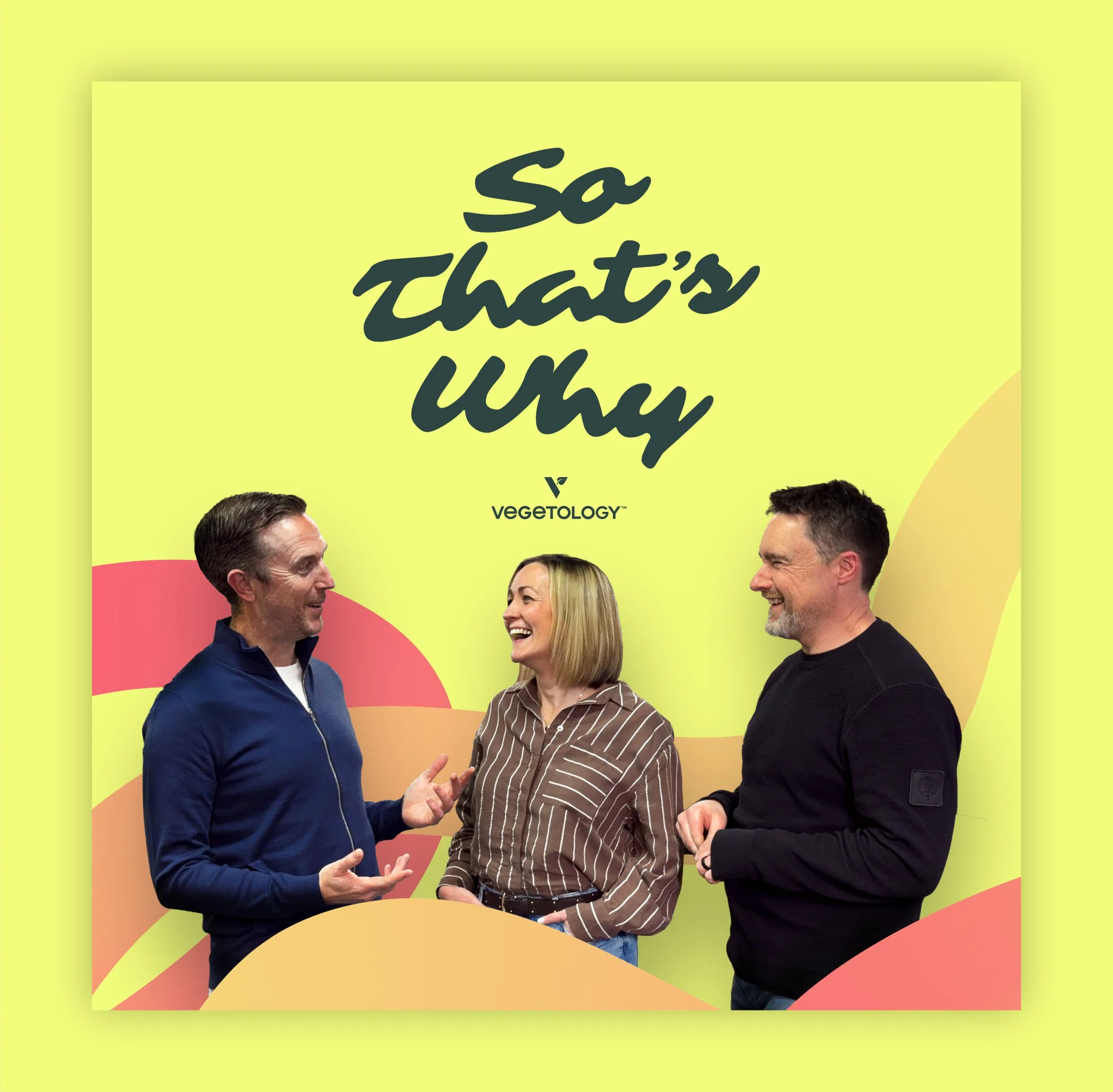
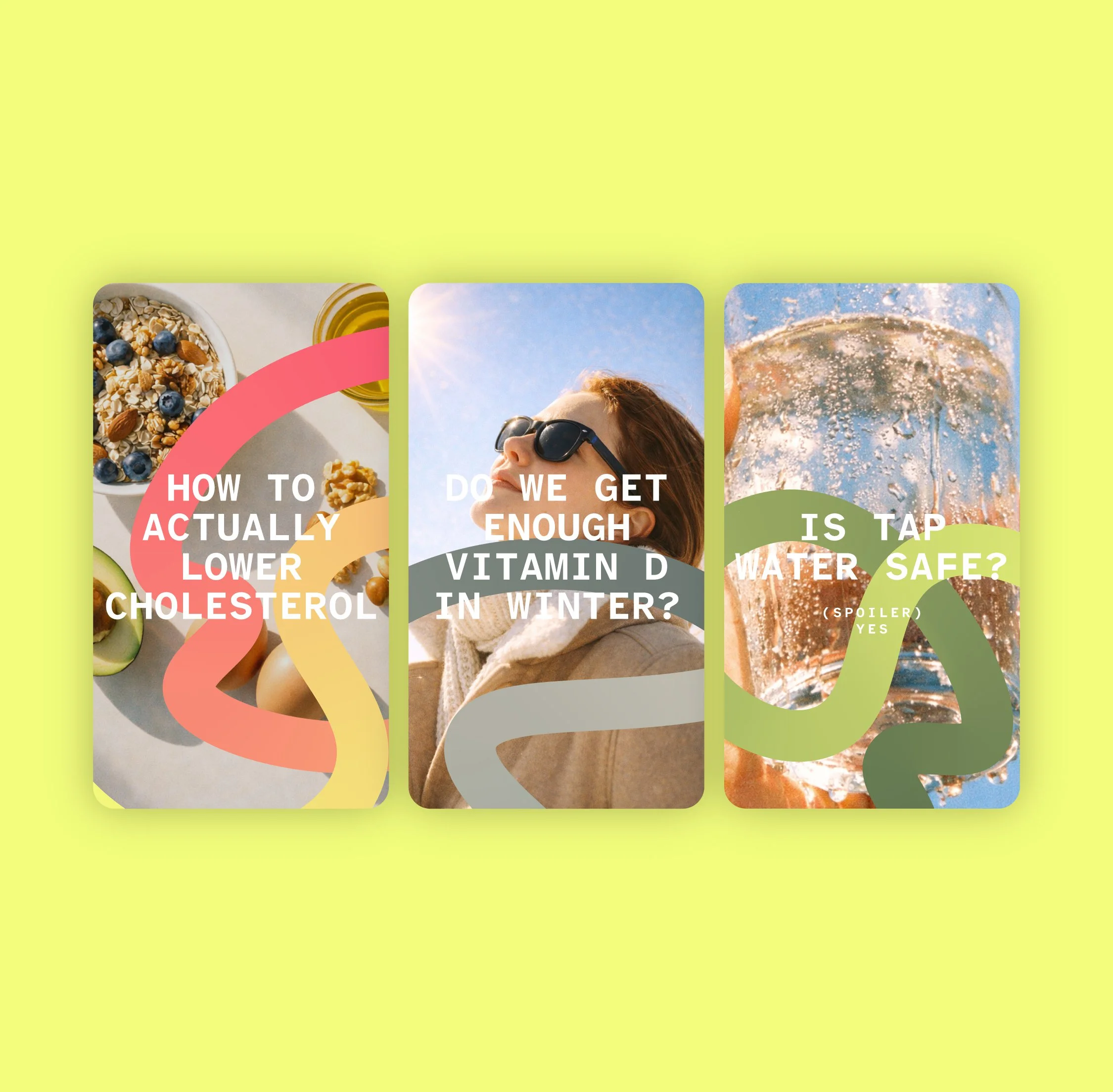
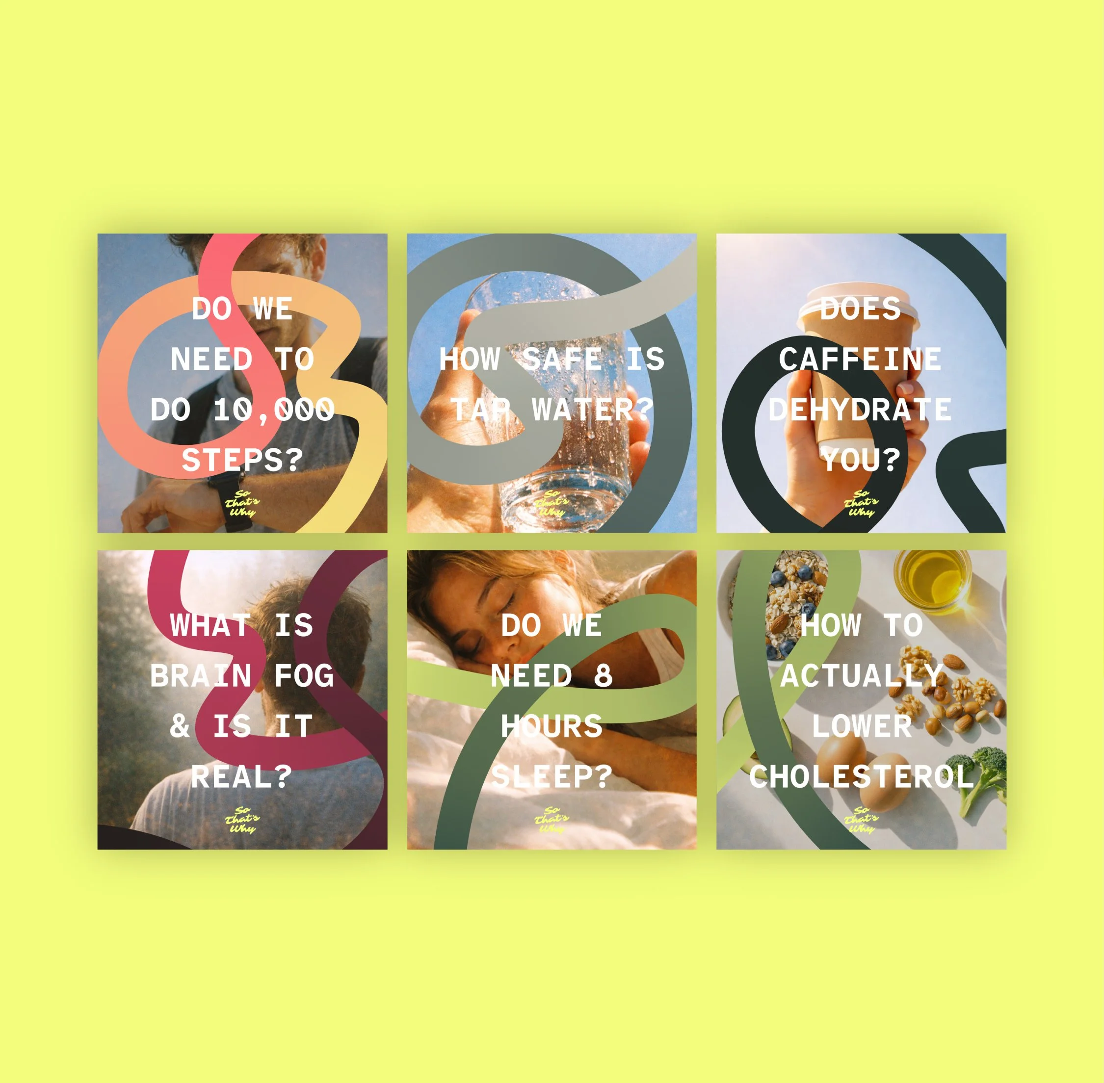
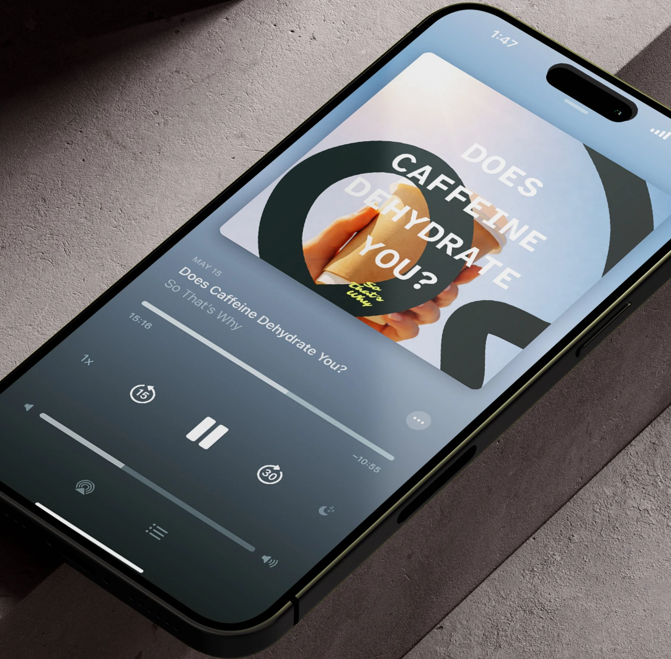
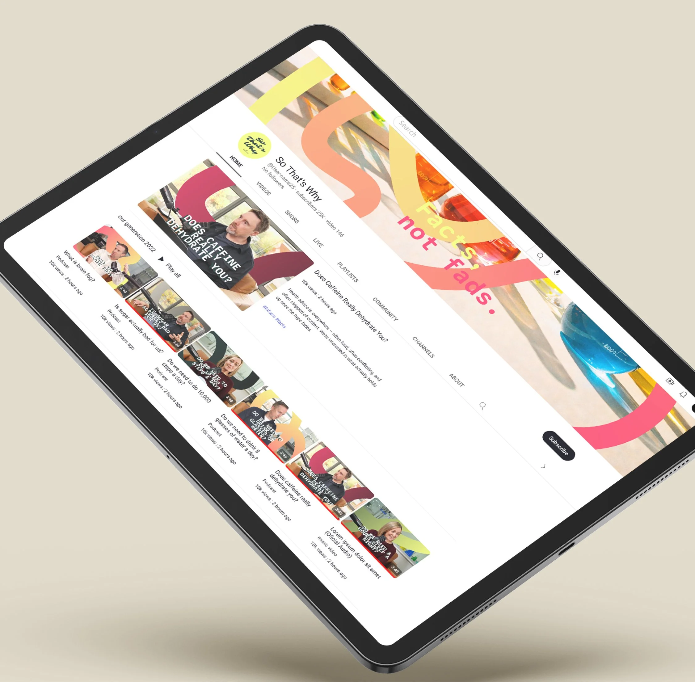
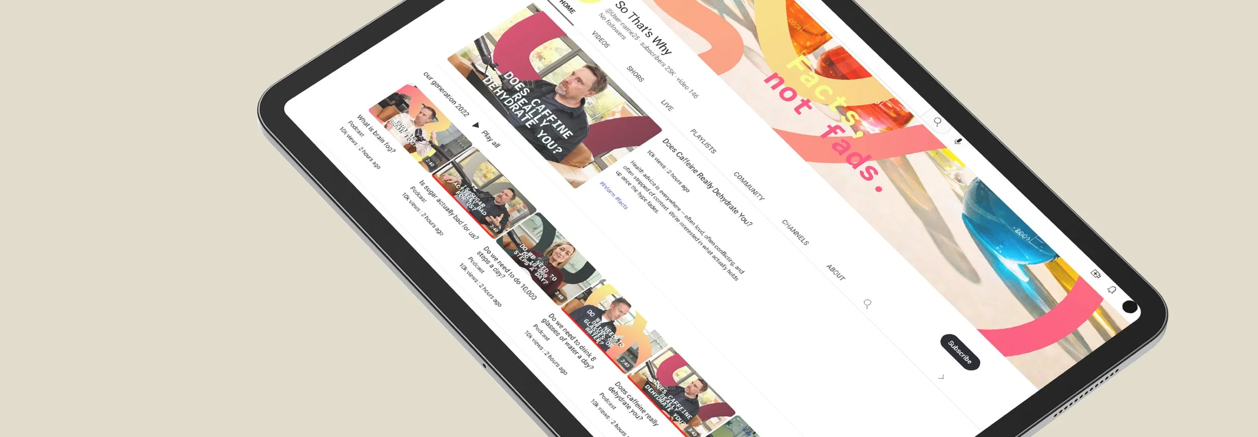
Rather than creating a fixed set of assets, we built a system that could flex. That covered the logo, cover artwork, episode templates, and a set of graphics designed to work across social, video, and podcast platforms. The thread idea carries through everything, with subtle motion used to show ideas connecting and coming together. Nothing over the top, just enough to add a bit of life. We also set out clear direction for typography, photography, and layouts so everything stays consistent as new episodes are created and shared.
It’s still early days, but there’s already been a strong response. The brand helps the podcast feel clear and considered from the start, which makes a big difference when you’re launching something new. It sits in a nice place between being approachable and credible, which is key in this space. More than anything, it gives Vegetology a platform to share what they know in a way that feels useful and easy to engage with.
The goal was to create something simple and thoughtful that wouldn’t get in the way of the content. Just a clear, flexible identity that supports what the podcast is trying to do. It’s a solid starting point, and something that can keep evolving as So That’s Why grows.