For The Long Haul
Brand Identity // Website
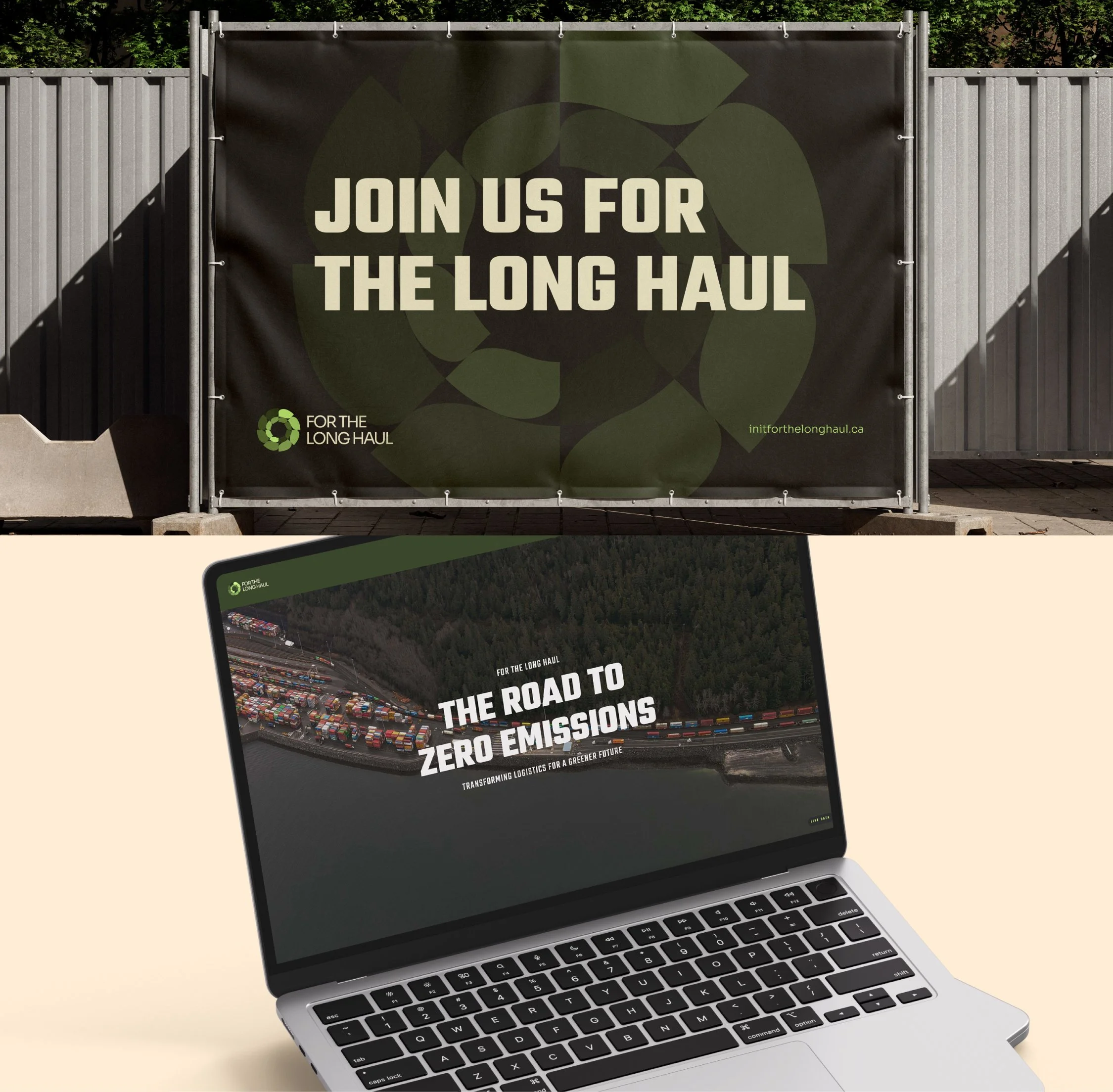
I recently had the pleasure of partnering with &Sons Creative to undertake a complete branding and website design for ‘For The Long Haul’ , a new project from Innovate BC that looks to provide industry information on sustainable trucking solutions.
Visit initforthelonghaul.ca
The Vision Behind the Design
“In It For The Long Haul” is a Canadian website dedicated to offering insights, resources, and guidance on sustainable trucking and the broader logistics industry. The platform aims to support truckers and logistics professionals by providing them with valuable information on industry trends and best practices.
I aimed to design a website for “In It For The Long Haul” that goes beyond merely providing information by using large, punchy statements and compelling imagery. This approach creates a dynamic and impactful user experience, making the brand feel like a movement. The bold visuals and strong messaging are intended to inspire and engage the community, reinforcing the idea that we’re all in this journey together.


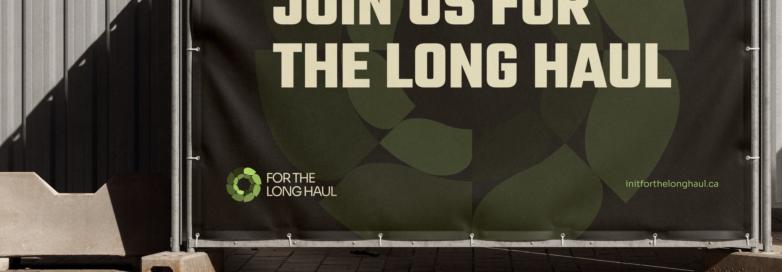
Logo:
The circular design, reminiscent of a vehicle wheel, symbolizes the brand’s dedication to enduring journeys and sustainable transportation solutions. This dual imagery of a wheel and leaves beautifully merges the concepts of mobility and environmental stewardship, highlighting the brand’s commitment to long-term ecological responsibility.
The use of leaves emphasizes a connection to nature, growth, and renewal, reinforcing the brand’s focus on sustainable practices. The varying shades of green suggest diversity within a cohesive system, aligning with the brand’s aim to incorporate multiple facets of sustainability. Overall, this icon effectively communicates “For the Long Haul’s” core values of enduring impact, environmental consciousness, and sustainable growth, essential for a brand dedicated to making a positive difference over the long term.
Color Palette:
The color palette for this eco-friendly brand is thoughtfully designed to convey its core values and visual identity. Forrest Green (#384533) serves as the primary color, symbolizing nature, growth, and stability, making it ideal for logos and key elements that emphasize sustainability. Complementing this, Bolt Green (#C7F059) adds a touch of freshness and energy, perfect for accents and call-to-action buttons, highlighting the brand’s forward-thinking and eco-conscious approach. Stone (#F5F0C5) introduces a warm, calming neutrality, suitable for backgrounds and secondary text, providing a natural and soothing balance to the bolder greens. Light Gray (#E3E0E0) contributes a sophisticated, modern look, useful for secondary elements and borders to keep the design clean and accessible. Finally, Road (#2E2E2E), with its subtle blue undertones, offers strength and reliability for text and icons, ensuring readability and adding depth to the overall palette. Together, these colors create a harmonious, vibrant, and sustainable brand image.
Working with Carly at &Sons was a privilege. Throughout the project, we navigated various challenges together, always finding the right solutions to ensure the final brand stood out. The branding for “In It For The Long Haul” effectively captures the essence of the trucking industry and the site’s commitment to supporting its audience. Through a well-researched and strategically implemented brand identity, the platform has established itself as a trusted and valuable resource for truckers and logistics professionals in Canada.