PodJunction
Brand Identity
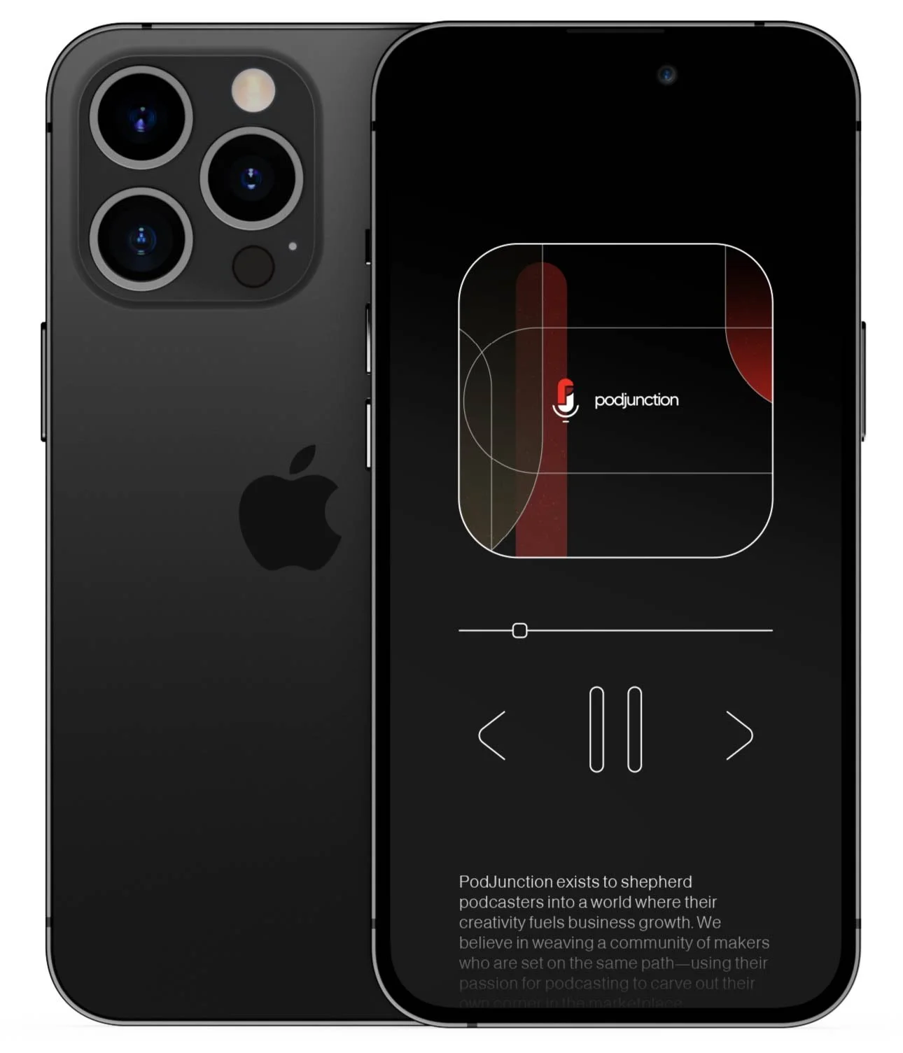
PodJunction exists to shepherd podcasters into a world where their creativity fuels business growth. We believe in weaving a community of makers who are set on the same path—using their passion for podcasting to carve out their own corner in the marketplace.
The logo shows a podcast mic, with a junction separating the P & J forms. It also nods to the patterns and shapes that make up the rest of the brand idenity.
As this was never intended to be a ‘customer facing business’ but more of an ‘insiders club’ the branding I felt needed to be elegant and understated, to help bring an exclusive feel.
Art Deco, with its distinctive elegance and geometric forms, gracefully weaves patterns that exude a timeless allure. Drawing inspiration from this iconic style, the intertwining motifs crafted in rich shades of red and green against a backdrop of deep black capture attention with their boldness. The stark contrast of white lines adds a touch of refinement, accentuating the intricate interplay of shapes and angles. These meticulously designed patterns evoke a sense of glamour and sophistication, effortlessly harmonizing the brand's vibrant colors using a modern twist on a familiar style.


